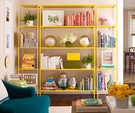
Sick of looking at that messy set of shelves? Want to make them more of a decorative focal point rather than a hodge-podge of clutter? Fret no more - here is a design on a dime tip that will help you achieve storage and style all in one.
The art of the stack:
1) Start with a few chunky books. Three or four is usually enough. If you don't already have a library of books, you can always hit up Goodwill or a secondhand bookstore to find some books with character.
2) Put the biggest books on the bottom, then stack the others like a pyramid, getting smaller at the top.
3) You have two options for positioning; lay them even with the binds flush with each other, or place them slightly askew - but never at purposeful diagonals, which looks too forced.
4) Top off your pile with an object that has a rounded shape, like a sculpture or a footed bowl. Make sure it fills enough space on the top book so it doesn't look dinky.
5) Fill the unused space on the shelf with vases, picture frames, collectibles and/or decorative pieces that have meaning to you. Adding dimension to your shelves with different heights and textures. Thrift stores, flea markets and clearance sections of retail stores are great places to find inexpensive treasures that you can prime and re-paint (if need be) for decorative bookends, etc.
Want to add a splash of color to your shelves? Try this fun tip from Better Homes and Garden:
Remove the jackets, then group books by color, standing some upright and stacking others. Shelves will seem more organized and have an artistic, color-blocked look.
Want to take your shelves to the next level? Start in the back. Simple inexpensive bookcases become stunners when their backs are dressed up with paint, fabric or wallpaper. Eddie’s Billy Bookcase was brought to life with a pattern that accentuates the balanced display of books and collectibles.


No comments:
Post a Comment